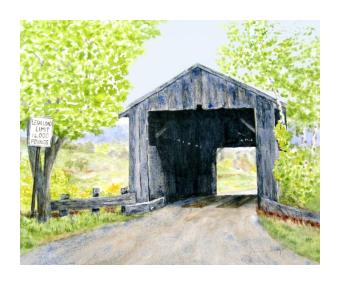
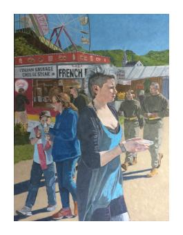
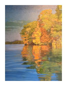
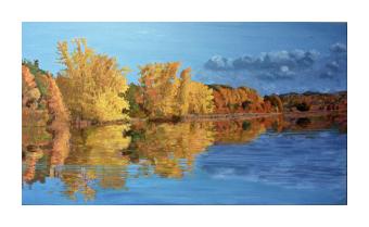
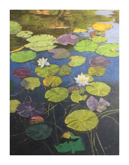
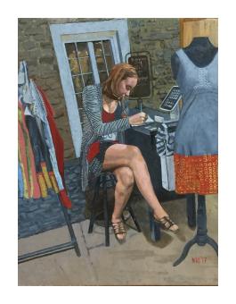
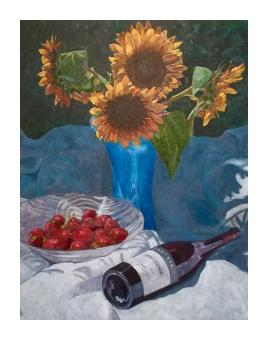
My painting is about color. I employ stacks of associated colors that breathe through each other to create a vibrant, textured surface that is fun to investigate. I start by creating what is essentially a color negative, the under-painting. To determine the proper color for the large masses of the first layer, I stare for 30 seconds at the color I want to end up with and then gaze with unfocused eyes at a white sheet of paper. A “ghost” image appears—for instance, a ghost cerulean blue shows up, having stared at a cool red. A grove of pines in full sunlight start out dark brick red; yellow aspen begin their graphic life violet. By allowing the under-painting to peak through by not completely over-painting, the eye blends the push-pulled colors, lights and darks, and places objects in space in a fascinating and unique way. A second concept: The most effective paintings, the ones that sparkle and catch your eye contain warms, cools and earth tones. They also have light lights and dark darks. (There is nothing worse than a “flat” painting.) Shadows hold cool purples and blues, as well as warm darks. Brighter passages hold warms, but also subtle cools. Paintings are not photographs. A landscape must show, not what is there, but what the artist feels about what is there. I show my passion for life and art by creating exciting paintings with stacks of complementary colors, salt and peppered with warms, cools and earth tones—with plenty of value contrasts between them.